
For anyone who has to work out whether the room, the system or one person’s habits are the problem — when two people in the same room complain about opposite extremes of the indoor climate.
Temperature monitoring with sensors means the temperature in the room is measured automatically around the clock, so you can see how it develops over time instead of reading a thermometer when someone speaks up. That is the difference that settles the argument: a single figure tells you where the temperature is right now, while a series of measurements tells you when it slipped, how long it lasted, and whether it happens at the same time every day.
Why one thermometer rarely ends the discussion
The classic situation: someone has put a thermometer on the windowsill, and it reads 24 degrees. Someone else has a fan heater under the desk. Both of them are right, because they are not measuring in the same place — and neither of them is measuring what happened at three o’clock yesterday afternoon.
Temperature in a room is not a single figure. It varies with the distance to the window, with the path of the sun across the façade, with whether the door is open, and with how many bodies are in the room. A room that is comfortable at nine can be uncomfortable at two, without anyone touching a thermostat.
With our solution Indoor climate in RoomAlyzer Air you measure the temperature continuously in the occupied zone using wireless sensors, and that lets you see the whole pattern: the curve rising from midday, the drop after people go home, and the difference between Monday and Friday. It makes it far easier for you to answer a complaint about the indoor climate or resolve a disagreement. Because once you have the history of the temperature, you have data in black and white rather than impressions and feelings that are hard to get a grip on. As a rule it also gives you a clear indication of what is causing the temperature problem.
What the temperature should be
There is no single right figure for every room. For office work, the most widely used bands look like this:
| Situation | Recommended range | Source |
|---|---|---|
| Heating season, office work | 20–24 °C | EN 16798-1, category II |
| Cooling season, office work | 23–26 °C | EN 16798-1, category II |
| UK office guidance | 21–23 °C in winter, 22–24 °C in summer | CIBSE Guide A |
The CIBSE figures are industry guidance rather than law. The legal requirement in the UK is simply a ‘reasonable’ temperature, and the Approved Code of Practice to the Workplace (Health, Safety and Welfare) Regulations 1992 puts that at a minimum of 16 °C for normal office work. Note too that the band moves with the season. The body adapts to the outdoor climate, which is why 25 °C feels pleasant in July and oppressive in February. In RoomAlyzer the thresholds switch between summer and winter, so your team does not have to remember to move them. When the season changes is in scenarios and thresholds.
Rooms without people follow entirely different rules. A museum store, a cold room and a server room each have their own requirements, and none of them have anything to do with comfort. That is why every room is assigned a scenario under Administration → Thresholds — a ready-made set of thresholds for the room type, chosen from 135 presets. From that moment everything in the system is coloured according to exactly those figures.

How to follow the temperature in practice
Following how temperature and indoor climate develop is straightforward in RoomAlyzer Air, which means you can find the figures you need quickly.
The sensor list shows the live temperature for every room in your hierarchy. Click the figure and you get a quick chart for the last 24 hours — enough to decide whether this morning’s complaint was a one-off.
The charts are where patterns become obvious. You can overlay up to five sensors, set the period to a week or a year, and have the scenario’s green, amber and red zones drawn in as the background. If the period crosses 1 May or 1 October the zones are split, and a dashed line marks the change of season. Zoom in on a couple of days and the chart switches from hourly averages to the individual measurements.
One detail that has saved a good many wrong conclusions: if a sensor has been moved to another room inside the period shown, a vertical relocation marker is drawn on that day. A jump in the curve at the marker is therefore not necessarily the room changing temperature — it may be the sensor changing room.
Map and floor plan colour the whole floor by temperature, so cold and warm zones stand out geographically. This is often where the pattern becomes plain: the entire west side is red in the afternoon, the north gable is blue in winter.
Location charts are the outlier finder. One parameter, many sensors, aggregated by the hour — built to find the one room that stands apart from the rest.
When you are not looking yourself
Few people have time to open a dashboard in RoomAlyzer Air every morning. So the system does the work:
Notifications send an email or a text message when a room goes above or below its threshold. You set the sensitivity yourself, so a single warm hour does not fill up the inbox.
Deviations works out afterwards how much of the time each room spent below, within and above the threshold — with a 24-hour distribution that shows whether the problem is every afternoon or only when the building is full. The ranking points to the worst rooms, measured either on the longest continuous deviation or on the largest.
Charts by email send the chart straight to the inbox daily, weekly or monthly, so you spot the trend without going looking for it.
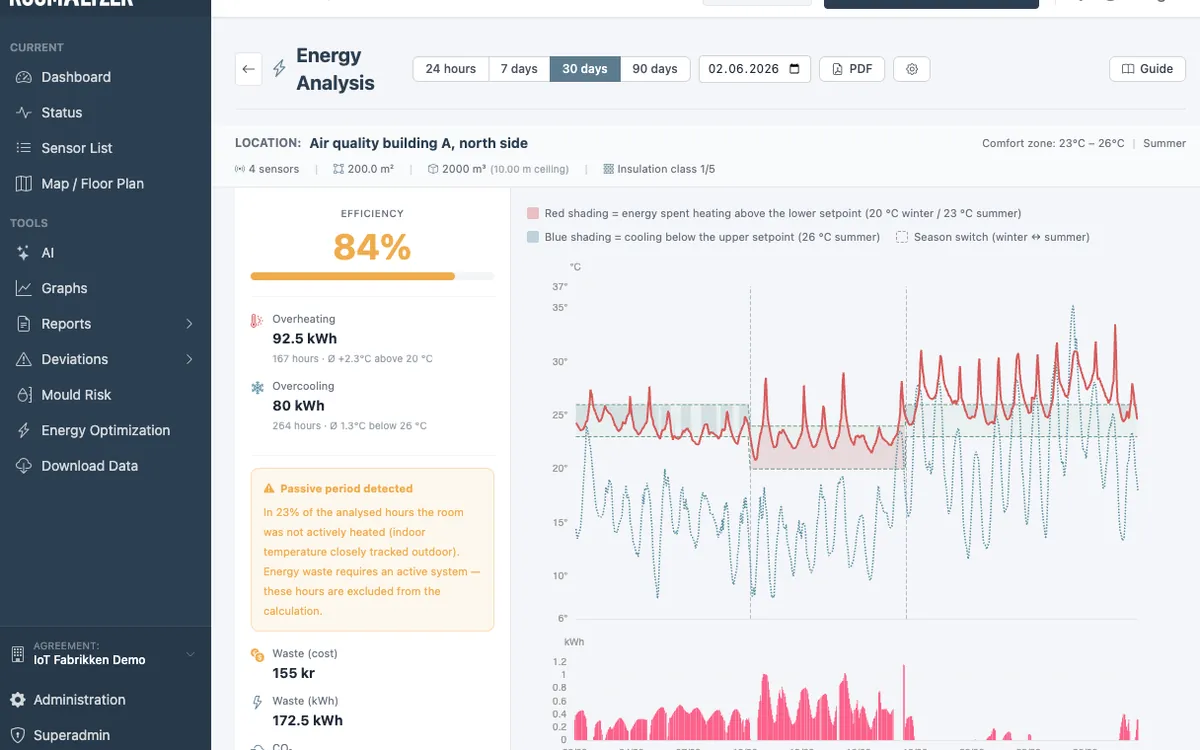
Energy optimisation turns the figure around and asks what the overheating costs. If rooms sit systematically above the lower comfort band during the heating season, the difference is wasted energy — and it is converted into kWh, pounds and CO2 using the building’s data. The model follows the two-setpoint principle from ISO 52016-1 and ASHRAE 90.1 and requires the building data to be set up under Administration → Energy configuration. It is quick to fill in, so you get an equally quick answer on whether you can optimise energy use in the rooms where you measure.
Where the sensor should sit
A measurement is only as good as its placement. Three things decide most of it:
- Height: in the occupied zone, 1.1–1.7 metres above the floor. That is where people actually are.
- Away from false signals: not in direct sunlight, not above a radiator, not right beside a ventilation outlet. Keep at least half a metre from heat sources.
- One per thermal zone: a large room with both a north and a south façade is two zones, not one. A high ceiling or strongly varying occupancy also argues for more sensors.
Accuracy depends on the sensor type. Full+ sensor and Mini+ sensor measure temperature to ±0.1 °C and drift by less than 0.03 °C a year, while an Outdoor sensor is accurate to ±0.4 °C. If a sensor does drift, it can be compensated under Administration → Calibration.
If it is the humidity rather than the heat causing trouble, humidity monitoring sits right alongside. And if you need to document summer heat for health and safety purposes, the rules and the report are covered here.