Are you the one who gets the complaints about stuffy air and heavy heads? And would you rather answer with a figure than a feeling? Then read on.
CO2 monitoring is the most direct way to see whether a room is being ventilated in step with the number of people using it. We all breathe out CO2, so when the concentration rises it is a reliable sign that the air is not being changed quickly enough. Outdoor air sits at around 420 ppm; a good indoor climate stays below 800 ppm, and above 1,200 ppm the air change is genuinely insufficient. A CO2 sensor in the room makes that invisible build-up visible — hour by hour, day by day.
Why CO2 is the most honest figure in the room
Temperature is open to debate — someone is always cold, and someone is always too warm. CO2 is blunter: the figure rises when there are people in the room and falls when the air is changed. That is why CO2 is used as an indicator of air change: a high ppm figure does not mean the CO2 itself is toxic, but that everything else that comes with an occupied room — moisture, odours, airborne viruses, drowsiness — is not being aired out either.
You notice it before you measure it. The meeting room that feels fresh at 9 am and heavy at 2 pm has not changed temperature — it has used up its air change. With a series of measurements you can see exactly when the curve turns: which room, which time of day, which days. Then the discussion becomes ‘these are the three rooms where CO2 goes past 1,200 ppm every Tuesday after lunch’ instead of ‘somebody thinks it is stuffy in here’.
Thresholds: when is CO2 too high?
The most widely used thresholds come from EN 16798-1 (the European indoor climate standard, which the Building Regulations (Approved Document F) also draw on). In practice you work with three zones:
| Zone | CO2 level | What it means |
|---|---|---|
| Green | below 800 ppm | Air change is keeping up with how the room is used |
| Amber | 800–1,200 ppm | Warning — the air is being used up |
| Red | above 1,200 ppm | Air change is insufficient; take action |
The same thresholds apply to an open-plan office and a school classroom, but not to every room. That is why the Indoor climate module in RoomAlyzer works with scenarios: a ready-made set of thresholds for the room type. You assign a scenario to a sensor or to a whole location under Administration → Thresholds, and from that moment everything in the system is coloured according to the thresholds that apply to that room. Which sets are ready is in scenarios and thresholds.

What the measurements look like day to day
The sensors measure continuously, and you decide how closely you want to follow along:
- The sensor list shows live readings for every room in a single hierarchy — click the CO2 figure and you get a quick chart for the past 24 hours.
- The dashboard gathers the rooms you want to keep an eye on as widgets: KPI figures, charts, heatmaps or a top 10 of the highest levels right now. It can also be shown on an information screen via a TV link.
- The charts plot the CO2 curve across days or months with the scenario’s zones drawn in as a coloured background, so a breach stands out immediately — and you can zoom right in on the individual measurements when you want to know exactly when the curve crossed the threshold.
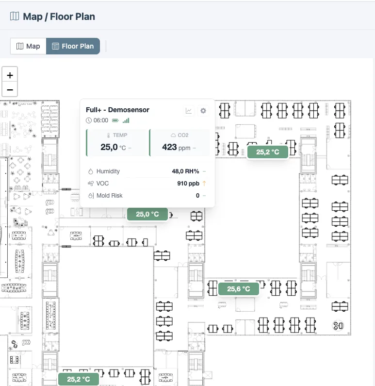
- Maps and floor plans colour each room according to its current CO2 level, so a whole floor can be read at a glance.
And if you would rather not watch it yourself, you do not have to: notifications send an email or text message when a room breaches its threshold — with a sensitivity you set yourself, so a single heavy hour does not turn into noise in your inbox.
From a single reading to a pattern
What matters is rarely one breach — it is the pattern. This is where the system does the work:
Deviations shows what share of the time each room spends in the green, amber and red zones over a chosen period, and which rooms come off worst. The 24-hour distribution reveals whether the problem is every afternoon or only when the building is full.
Ventilation detection turns the figure around: from the fall in the CO2 curve, the system works out automatically when a room was actually aired, for how long, and what air change that produced — so you can see whether good intentions about airing actually come to anything.
The AI assistant answers the questions you would otherwise have to dig out yourself: ‘When during the day is CO2 highest?’, ‘Is there a difference between weekdays and weekends?’, ‘Compare the meeting rooms in November’. The answers are built on your own measurements, not on guesswork.
Documentation, when someone asks
When the health and safety representative, the board or a parent asks about air quality, a series of measurements beats a set of minutes. The location report gathers every room at one address into a single PDF — downloaded now or scheduled for every Monday morning. And if you need to document against a standard, there are dedicated EPBD and DGNB reports that set the measurements against the comfort categories in EN 16798-1.
That is the quiet benefit of measuring continuously: the day the question comes, the answer is already there.
If you want to see how the figures connect with temperature and humidity, all three parameters are covered in the article on what indoor climate is made up of. And if it is the thresholds themselves you want to get straight, scenarios and thresholds are explained here.