This article is written for you if you need to know how full the office really is. Perhaps a lease is coming up for renewal or a move is being planned, and you have been given three different answers to the question of how much the office and its facilities are actually used.
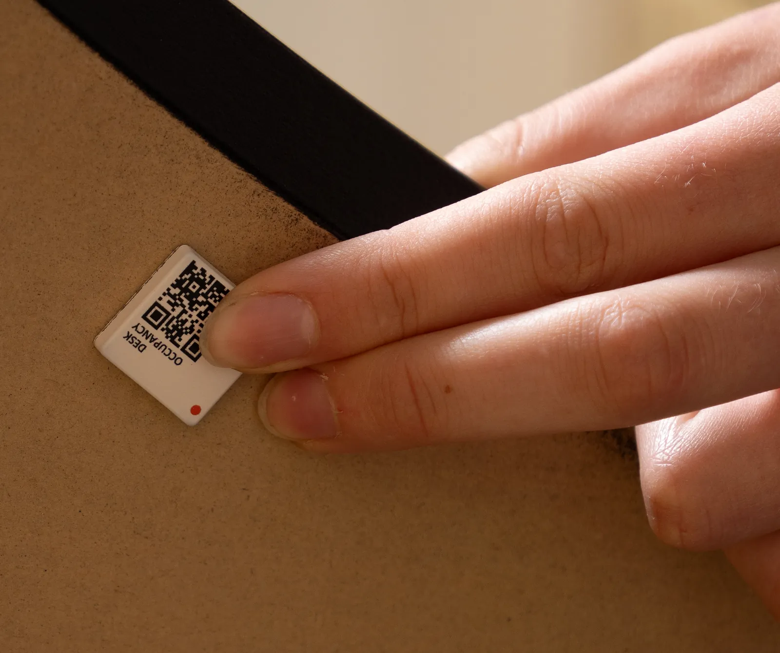
Space management is the measurement of how your seats are really being used. Sensors under the desks register whether anyone is sitting there, and out of those measurements comes what no booking system or access control can give you: which seats are used, when in the week, how many different ones are in use during a day, and how many are in use at the same time. The difference between those last two figures is usually what decides how much space you need.
Why the question is so hard to answer
Everyone has a feeling, and the feelings contradict each other. Whoever arrives early sees an empty office. Whoever turns up at lunchtime on a Wednesday cannot find a free seat. Management has an access control system that counts how many people went in — not how many desks were used, and certainly not for how long.
Booking systems have the opposite problem. They show what people reserved, not what they used. And the difference is big enough to change a decision: a seat booked all week and used for two days is not an occupied seat.
Measurement gives you what neither of them can: the actual hours, seat by seat. With our solution RoomAlyzer Space you get the realistic, usable overview you can act on and plan around. Dansk Industri used that documentation to free up 650 square metres of office space, and the solution is still being developed, so you keep getting the latest and best ways to measure.
Two figures that are not the same
If you take only one thing away from this article, take this one.
- Peak concurrent: The highest number of seats that were in use at the same time that day. That is the figure that decides how many chairs need to be there.
- Distinct seats used: The number of seats that were occupied at some point during the day — including those used in shifts. It is always higher, and the difference is the rotation.
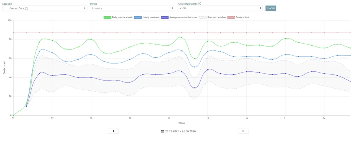
In the charts, both appear in the same bar: the dark base is peak concurrent, the light top is the seats that were only used at other times. If the light part is large, the seats are already being shared, and you can manage with fewer than the number of names on the list suggests. If it has almost gone, people are sitting at their own desk all day.
RoomAlyzer Space also averages only over active days — days on which at least 10% of the peak day’s number of seats was used. Without that rule, closure days, weekends and public holidays would drag the average down and make the office look emptier than it is.
How you see it
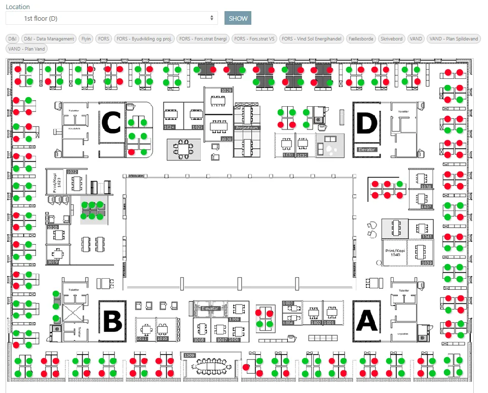
The floor plan is the view people understand straight away, because it looks like the office they know. It has three modes:
- Live colours each desk green for free, red for occupied or grey for unknown, and updates roughly every minute.
- History colours the desks as a heatmap by the metric you choose — utilisation, active days, average session length or peak day — over a period from a day to a year, with filters for time window and weekdays. Desks that are never used are clearly marked. The view can be downloaded as a PDF with the filters printed at the top.
- Replay plays back a past day in five-minute steps, so you can watch the office fill up and empty again. It is surprisingly effective in a room full of people who disagree about when it is busy.
Click a desk and you get a detail card with hours in use over the last 7 and 30 days, one bar per day for the last month, and a typical day across 24 hours.
The monthly calendar shows a percentage per day and hour — the share of desks in use — and can be exported to Excel, CSV or PDF. History → Charts is the large analysis view with flow and trend, a capacity line and the averages mentioned above.
And if you would rather ask than search, the AI assistant answers questions in plain language: which department uses its desks least well, when cleaning can typically start, which two departments overlap least in working hours. The answers are built on a calculated snapshot of your own data — the model words the answer, it does not do the arithmetic itself — and every answer names the period it rests on and the groups it is based on.
The seat model — when is a seat ‘used’?
Here is a decision worth taking deliberately, because it changes every figure.
A sensor sees presence in five-minute intervals. But is a seat free because the person is in a meeting for an hour? Most people would say no — the jacket is on the chair, and nobody else sits down. So you can choose how a seat is counted: raw measurement (only the intervals where someone is actually sitting there), held for the day (the default: once the seat is taken, it counts as occupied for the rest of the day), or clean desk with a limit of four hours or one hour without activity.
The model is applied retrospectively to all data, so you can switch it and look at the history with fresh eyes without losing anything. The current model is shown as a pill on the chart, so nobody ends up comparing two figures that were calculated differently.
If meeting rooms are the expensive part, right-sizing meeting rooms is covered here.